
Dirt Magazine
Type
Publication, User Experience
Location
Conestoga College
Year
2024
Dirt on Screen
This project aimed to design a cohesive and engaging magazine app prototype and a multi-page magazine, showcasing original content, storytelling, and thoughtful design systems. It combined user research, wireframes, branding decisions, and interactive prototypes with the creation of a fully designed magazine, featuring custom photography, illustrations, and layouts.


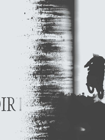
The Dirt Magazine project dives deep into what makes motocross more than just a sport—it’s a lifestyle. Focusing on the riders, the tracks, and the gritty, unfiltered energy that defines it, I drew inspiration from edgy editorial styles like RayGun, but made sure everything was still readable and engaging. The magazine mixes stories, interviews, and gear reviews, all while capturing the high-octane vibe of motocross culture.
I went through a bunch of name and logo ideas before landing on Dirt. Names like "Raze" and "Shred" were cool, but they felt too abstract. Dirt had that raw, no-nonsense feel that matched the spirit of the sport. The logo is bold but flows with the movement of motocross, and the asterisk (*) acts as a nod to the fuel cap, adding that little extra bit of detail.
I shot every photo for the magazine myself, keeping the imagery authentic to the motocross experience. Ads were integrated into the design to feel like they belonged rather than interrupting the flow of the story.


The app bridges the gap between print and digital, offering personalized content, a community space, easy navigation, and offline access for users always on the move. It’s all about enhancing the motocross experience, not just complementing the magazine.
User research played a big role in shaping the final design. While initial prototypes leaned into the grunge vibe of motocross, feedback revealed navigation issues. I refined the layout to make sure the design stayed bold but functional, with smooth animations and clean usability that still packed the punch of the sport’s energy.

 |  |  |
|---|---|---|
 |  |  |
 |  |  |
 |  |


